One brand.
Three products.
One language.
HyphenX brings multiple standalone financial products into a single platform. For that to work, users need to feel they are moving within one coherent product, not switching between separate applications. Each product had its own visual treatment and the existing brand CI had been designed for marketing, not for complex enterprise UI.
I reworked and enhanced the brand CI specifically for the platform, thinking about how components would need to adapt for future mobile use. The resulting design language is used throughout the platform and all email communications across every product on HyphenX.
Users should never have to relearn the UI when moving between products. The look, feel, and behaviour of every element, buttons, navigation, headers, tables, forms, modals, notifications, had to be consistent enough that the platform reads as one product at every touchpoint.
The full project team
Adapting the CI
for platform use
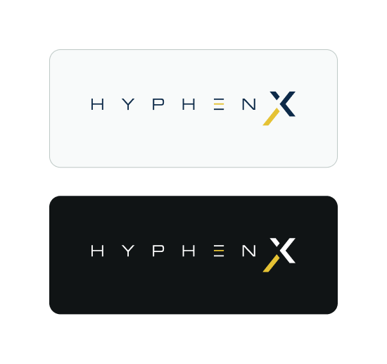
The HyphenX logo needed to work across both light and dark surfaces. The platform uses a predominantly dark interface, but email templates, onboarding flows, and certain product modules use light backgrounds. Both logo variants were prepared and governed with clear usage rules so the brand reads consistently regardless of context.
The brand amber/yellow, which was being used broadly in the existing CI, was scoped back in the platform UI to serve as an interactive indicator only: primary CTAs, active navigation items, and selected states. This gave the colour meaning and stopped it from creating contrast problems when used on large backgrounds.
The backbone
of the platform
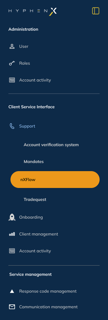
The side navigation is the constant across every product on HyphenX. It carries the HyphenX logo, groups menu items by section (Administration, Client Service Interface, Service Management), and uses the amber/gold highlight exclusively for the active product or section. A minimised state collapses the nav to icons only, giving more horizontal space on denser screens.
The nav was designed to scale: as more products are brought into HyphenX, new items slot into the existing hierarchy without disrupting the pattern. The grouping logic means users always know which section a feature belongs to.

Consistent structure,
product-aware content
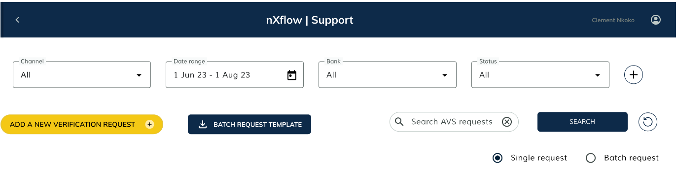
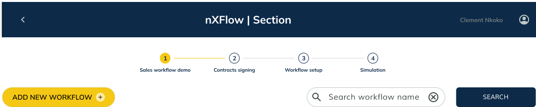
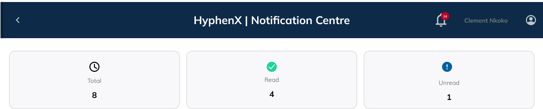
Every product on HyphenX shares the same dark header bar pattern: a back arrow on the left, the product and section name centred, and the user avatar on the right. The pattern is consistent but the content adapts to each product's needs. nXFlow adds a four-step progress stepper below the header to support its multi-stage workflow setup. AVS adds filter controls and action buttons for its verification requests. The header reads as one system across all three.
Six variants.
One clear hierarchy.
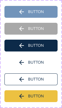
The button system was built to cover every interaction context across the platform. The gold/amber CTA is the primary action button, always the most visually prominent and reserved for the single most important action on any screen. The dark navy button handles secondary primary actions. Blue handles informational or system actions. The outlined and ghost variants handle tertiary actions without competing for attention. The disabled state is visually suppressed but maintains its spatial footprint so layouts do not shift when elements become active.
Each variant was designed with mobile adaptability in mind. Tap targets, label sizes, and icon placements were considered so that the same components could be extended to mobile interfaces without redesign.
Every state.
Light and dark.
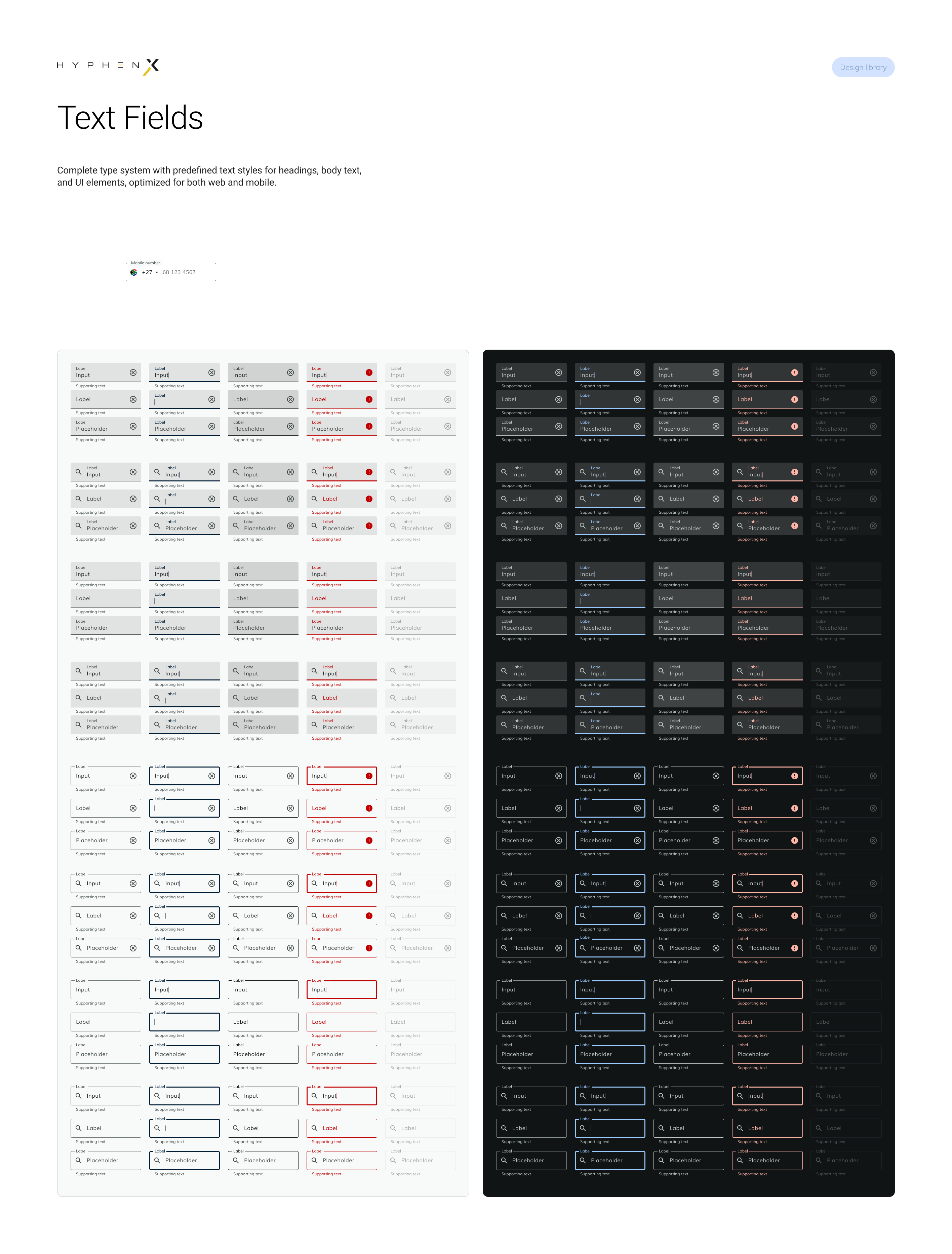
The text field system covers all states across both light and dark surfaces: default, focused, filled, error, disabled, and read-only. Enterprise platforms handle a lot of form interaction, verification requests, workflow configuration, user management, payment detail entry. Having a fully specced input system means every form across every product starts from a tested, accessible baseline. Error states use inline messaging directly beneath the field, keeping feedback in context without relying on separate toast notifications.
Multi-step flows
without disorientation
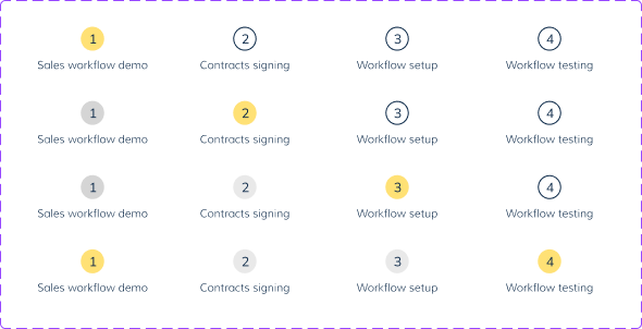
Several products on HyphenX involve multi-step processes: nXFlow workflow configuration, AVS setup, onboarding flows. The stepper component shows the user exactly where they are, what they have completed, and what remains. The gold active state makes the current step immediately readable. Completed steps show a solid filled circle; upcoming steps are outlined. The component handles four steps in the standard configuration and was designed to extend gracefully if a flow requires more.
The primary surface
of every product
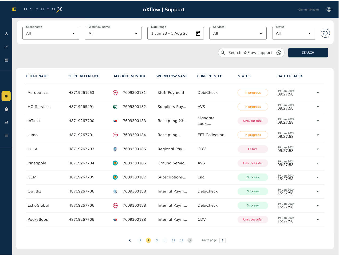
Tables are the dominant UI pattern across HyphenX. AVS displays verification requests in tables. nXFlow shows workflow queues in tables. Notification Centre lists tasks in tables. Every product uses tabular data as its primary output. The table system was standardised across all of them: dark column headers, consistent row height, status badge patterns, sort indicators, row hover states, and pagination controls, all unified so a user moving from the AVS table to the nXFlow table needs no reorientation.
Surfacing the right
information at the right time
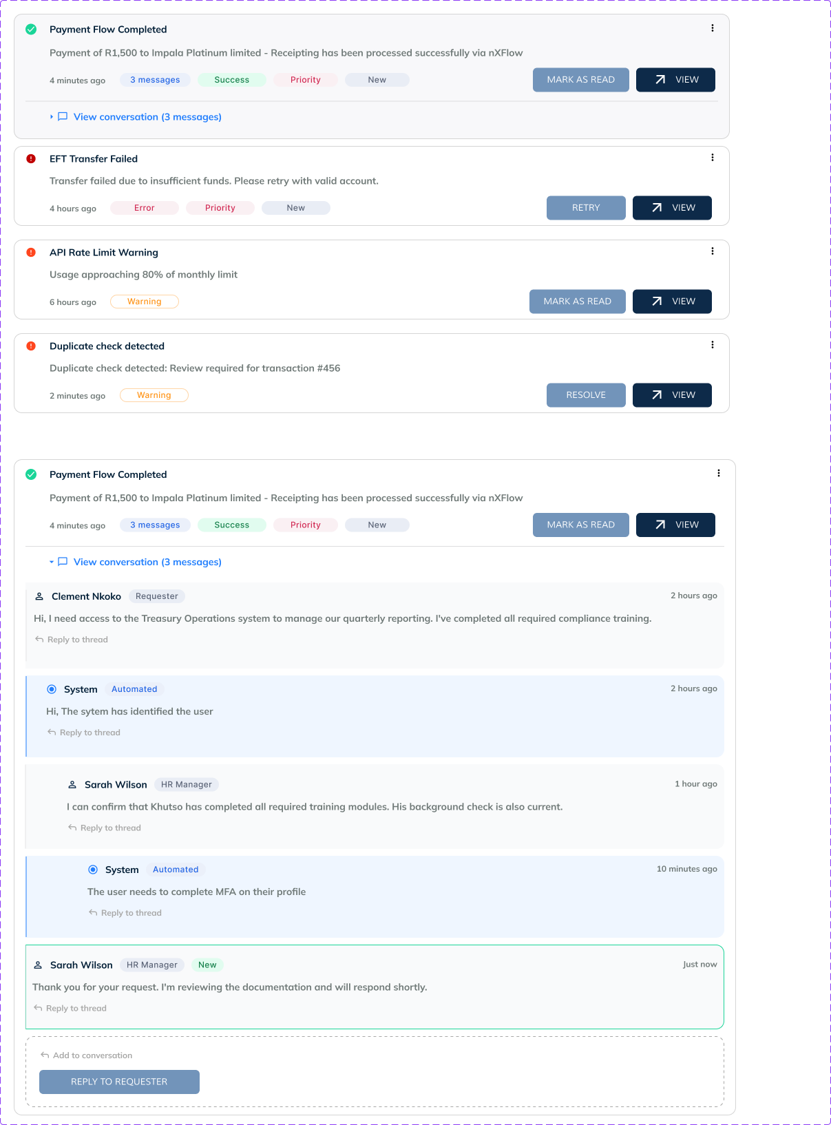
Notification cards communicate the outcome of platform events to users. A payment flow completes. A verification request fails. An API rate limit warning triggers. Each card carries the event title, a summary, status indicators (Success, Error, Warning), action buttons (Mark as Read, View, Retry), and a timestamp. Light and dark variants ensure the cards sit correctly on both surface types. The conversation thread view extends the card into a full task-resolution surface when an event requires human review and follow-up.
Interruptions that
respect the user
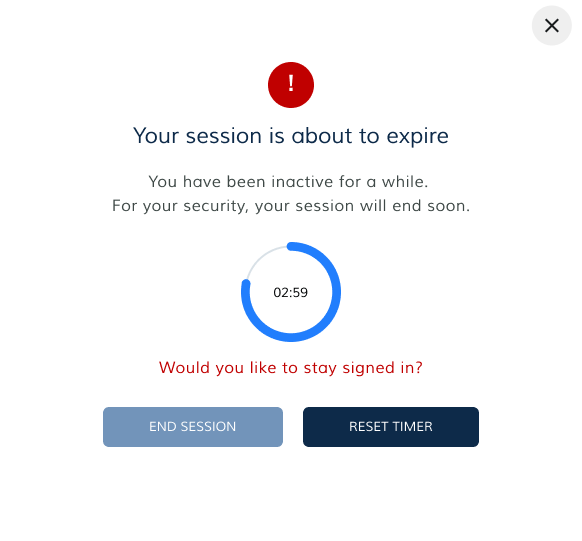
Modals are used sparingly and purposefully. The session timeout modal is one of the most important: it appears when a user has been inactive and their session is about to expire. The modal shows a countdown timer, a clear message, and two explicit choices (End Session / Reset Timer). There is no ambiguity about what will happen next. The financial platform context makes this particularly important, an unexpected session end mid-task can cause data loss or incomplete transactions.
The brand
off-platform
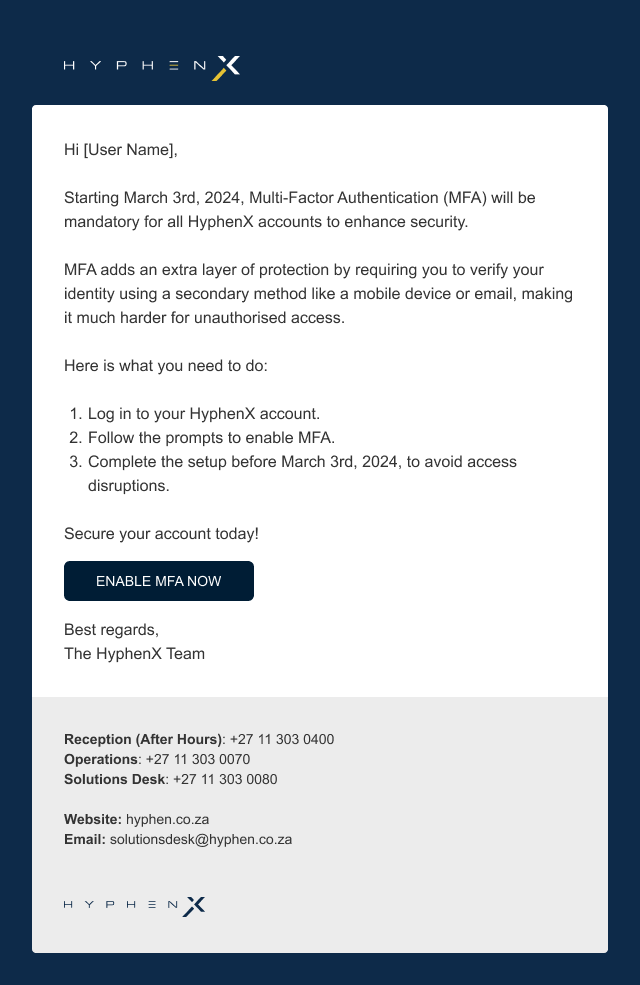
Every transactional email sent by the platform, MFA setup prompts, password reset links, verification confirmations, workflow updates, uses the same email template component. The HyphenX logo sits at the top. A clean white content area carries the message. The dark footer contains contact details, the physical address, and the logo repeated. Buttons in emails use the same dark navy as the platform, making the brand feel continuous even when the user is in their inbox rather than the product.
The template was designed to render correctly across major email clients. The component system makes it straightforward to produce new email types without redesigning from scratch.
Before the language.
After the language.
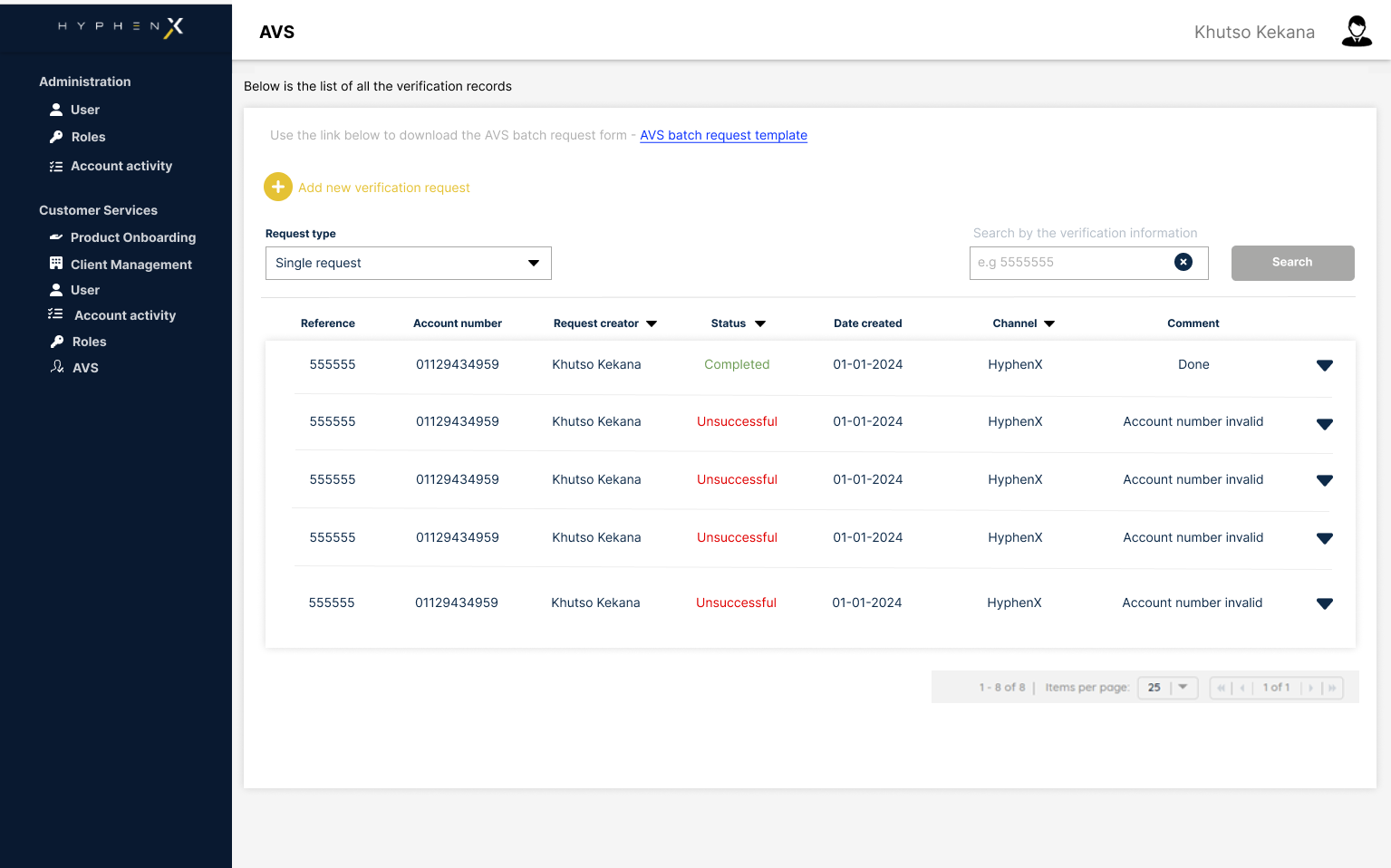
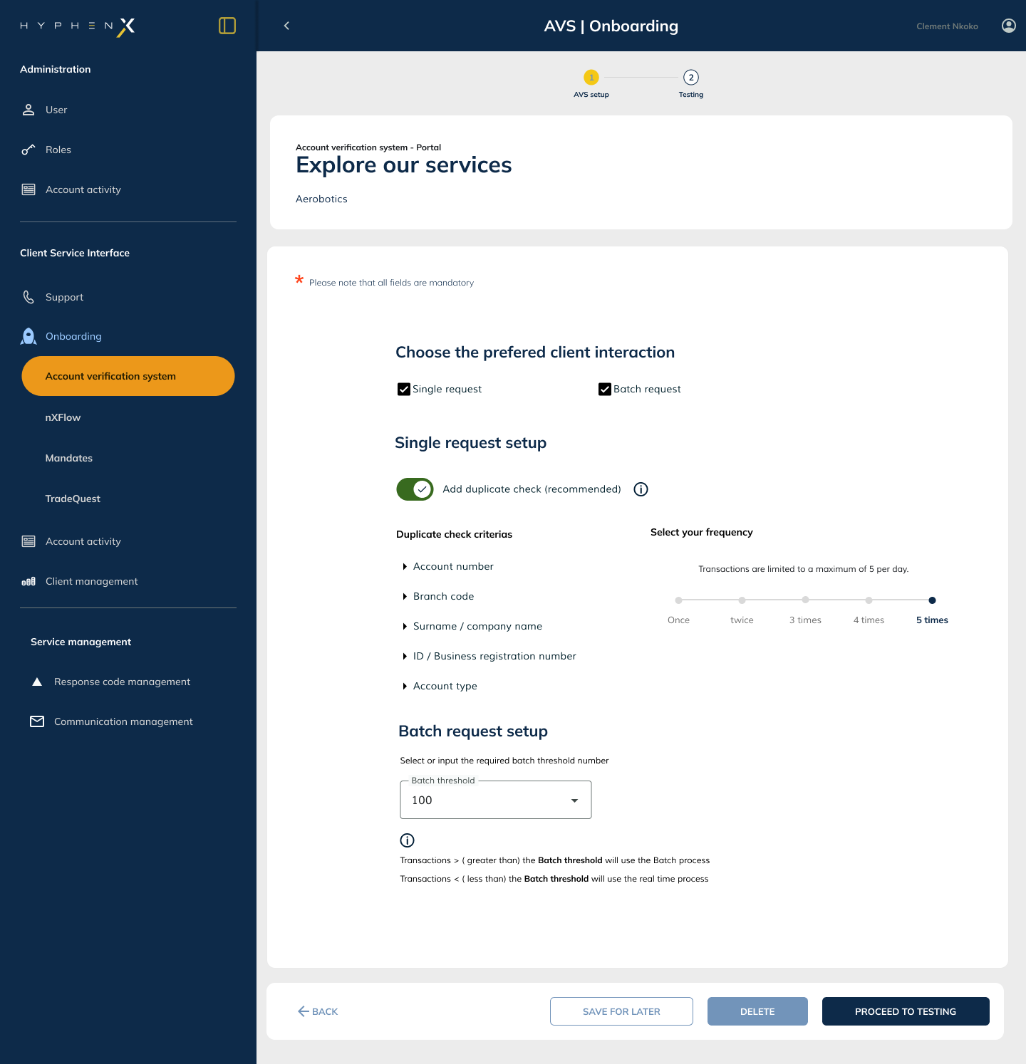
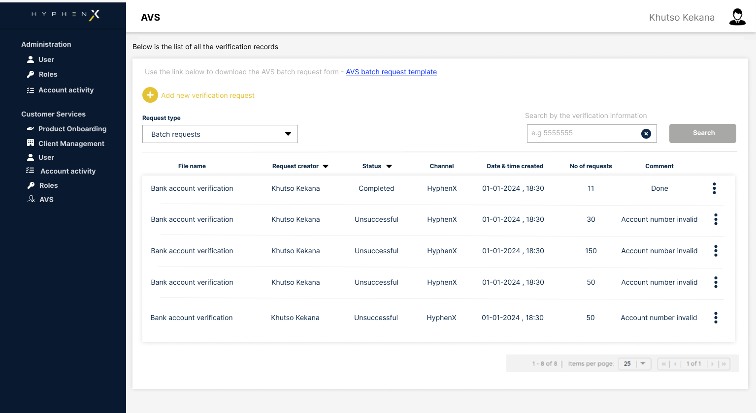
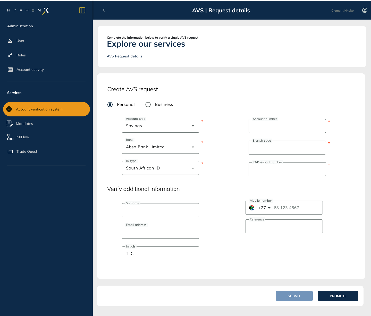
AVS existed before the design language as a standalone product with a light-mode interface built outside of HyphenX. The white background, the flat table layout, and the disconnected visual treatment were functional but felt like a different product entirely. After the design language was established, AVS was rebuilt within HyphenX: dark side navigation, consistent header, standardised table patterns, the HyphenX component library throughout.
The visual difference makes the point plainly. Same product, same data, same user tasks. Completely different experience of the platform.
A language that
scales with the platform
The design language was not built as a documentation exercise. It was built because it had to work across three products at different stages of development, and because new products will continue to be added to HyphenX. Every decision in the system was made with that in mind: will this component make sense in a different product context? Will a new designer be able to add a new table to this interface without breaking the visual rhythm?
The mobile adaptability consideration shaped how components were built at the unit level. Tap target sizes, touch-friendly spacing, and responsive layout behaviour were built in from the start rather than retrofitted. When HyphenX extends to mobile, the language extends with it.
Logo variants, colour system, CI adaptation for enterprise UI
Side nav expanded and minimised, active state treatment
Consistent header across AVS, nXFlow, and Notification Centre
Buttons, inputs, steppers, tables, notifications, modals
Template component used across all platform transactional emails