Making security legible for enterprise users
HyphenX needed mandatory Multi-Factor Authentication across Integration Services and Payments and Collections. The challenge went beyond designing login screens. It required a coherent system that could onboard new users, migrate existing ones, accommodate a Security Officer creation flow, and communicate every step through a carefully designed email system.
I led both UX and UI across this project, defining the user journeys, information architecture, interaction states, and the visual design of every screen and email template.
Enterprise users are not used to interruption. Introducing MFA required careful management of trust and clarity at every step, especially for non-technical users in financial institutions.
TOTP via Microsoft Authenticator (QR code setup), and a Security Officer-controlled creation flow for high-privilege accounts.
3 roles: New Client User, Existing Client User (migration), and Security Officer, each with their own flow and communication needs.
The full project team
From system design to final screen
User journey mapping across 3 roles
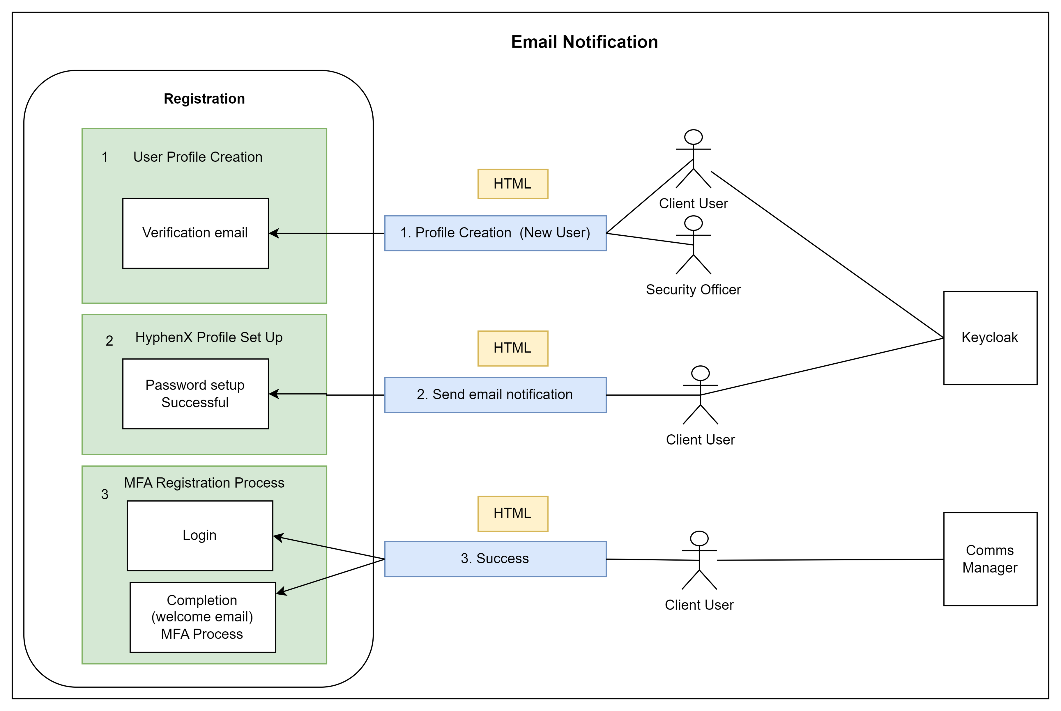
I mapped the complete experience for each user type: new user registration, existing user migration, and Security Officer creation. This surfaced overlapping touchpoints, divergent edge cases, and the email communications needed at each stage. Working closely with a system analyst, we established how Keycloak, Comms Manager, and the HyphenX UI layer would connect.
Defining the screen inventory
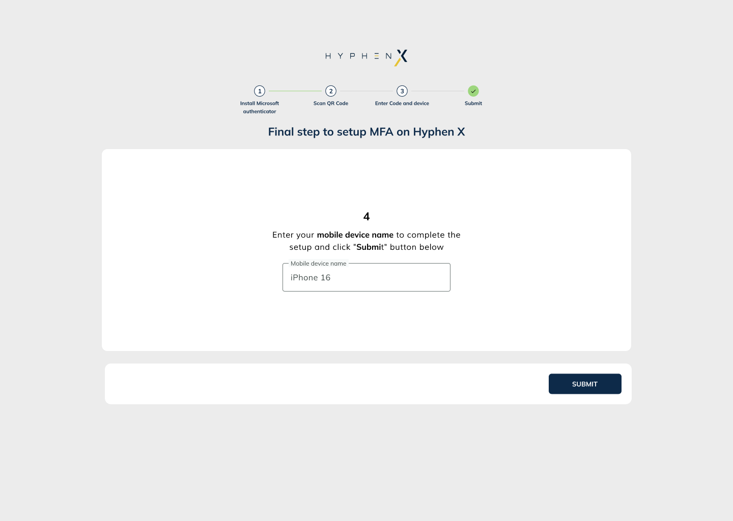
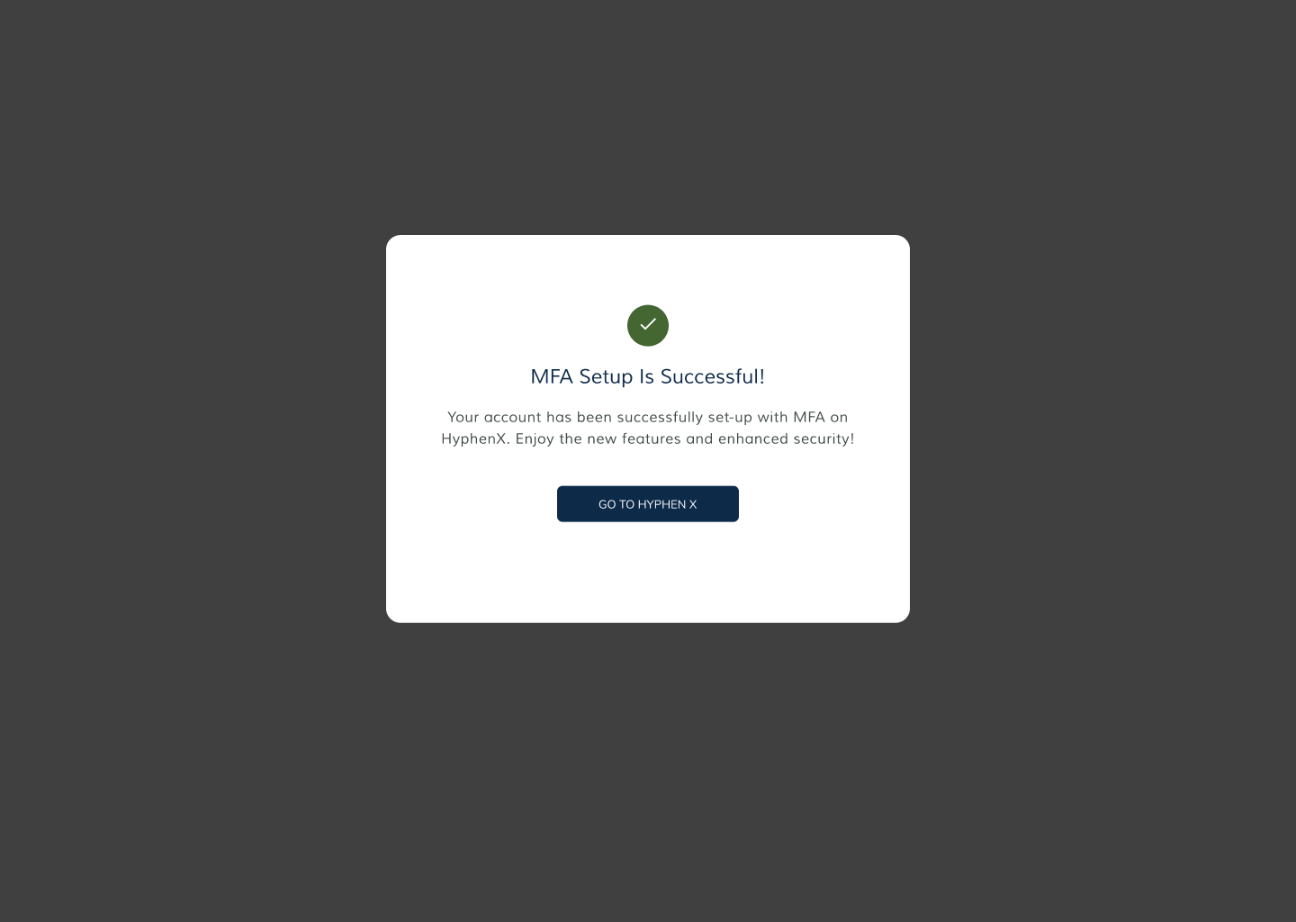
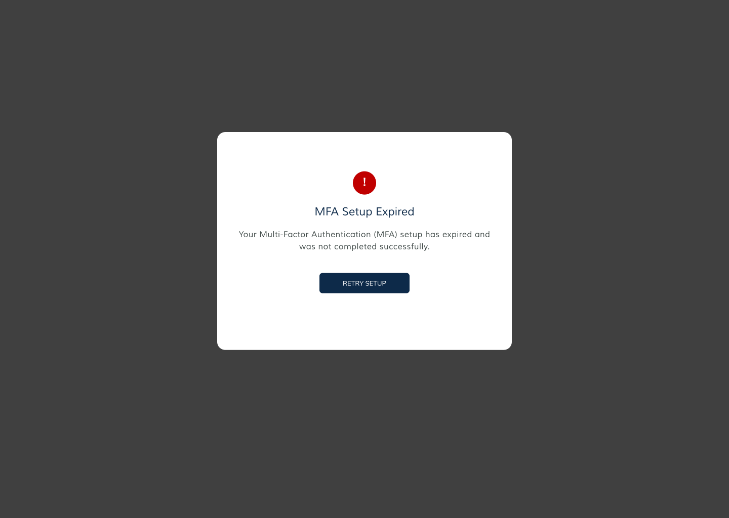
I audited the full screen count required: profile creation, email verification, password setup, MFA setup (QR code), OTP entry, success confirmation, deactivation pop-up, and re-activation screens. Each state required specific error handling, loading states, and success feedback, all mapped before any UI was drawn.
UI design within the HyphenX visual language
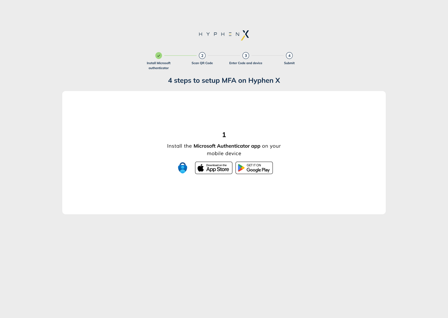
All screens were designed within the established HyphenX design language: dark navy background, amber primary action colour, and white type. I designed desktop-first at 1440px, ensuring form states, error messaging, button hierarchy, and QR code display areas all had clear visual logic and consistent treatment across the full flow.
Email system design (5 templates)
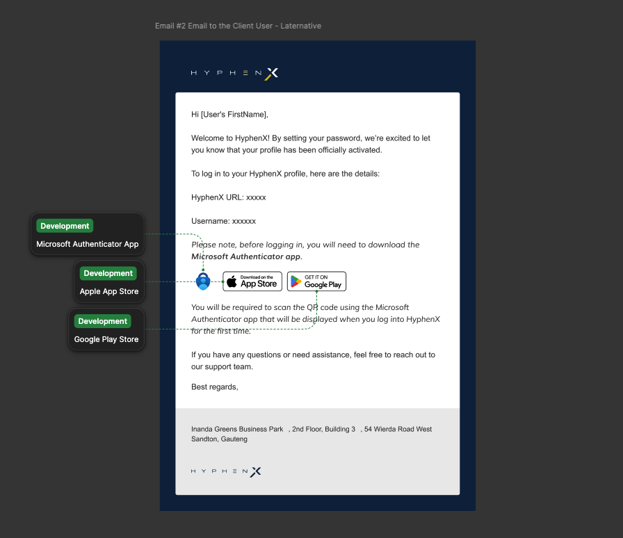
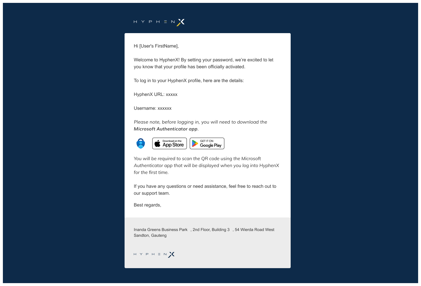
I designed 5 transactional HTML email templates: verification email to new client user, notification to Security Officer, MFA setup confirmation, welcome email with MFA guidance, and password change success. All templates respected the brand system and were built as responsive HTML layouts.
Security Officer flow and deactivation
A distinct flow was needed for Security Officers who create and manage other user accounts. This included a separate creation journey and a deactivation confirmation pop-up with intentional friction, requiring explicit confirmation of an irreversible action to protect against accidental changes on enterprise accounts.
Why these choices
Designing section by section through transition
This was not a blank-slate redesign. We were transitioning from an existing design into a new system, so screens were designed section by section rather than all at once. This required careful judgment about which inherited patterns to retain, which to adapt, and where to introduce the new design language without disrupting continuity for existing users.
QR code on a clean white surface
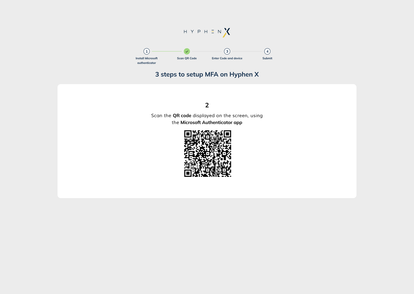
The Microsoft Authenticator QR code step is displayed on a high-contrast white modal within the dark platform UI. QR codes scan poorly on dark backgrounds. Surfacing it on white ensured reliable scan rates without breaking the visual system.
Intentional friction on deactivation
The deactivation modal uses copy that makes the consequence clear ("You cannot undo this") and a two-button structure to create a deliberate pause before an irreversible enterprise action.
One clear CTA per step
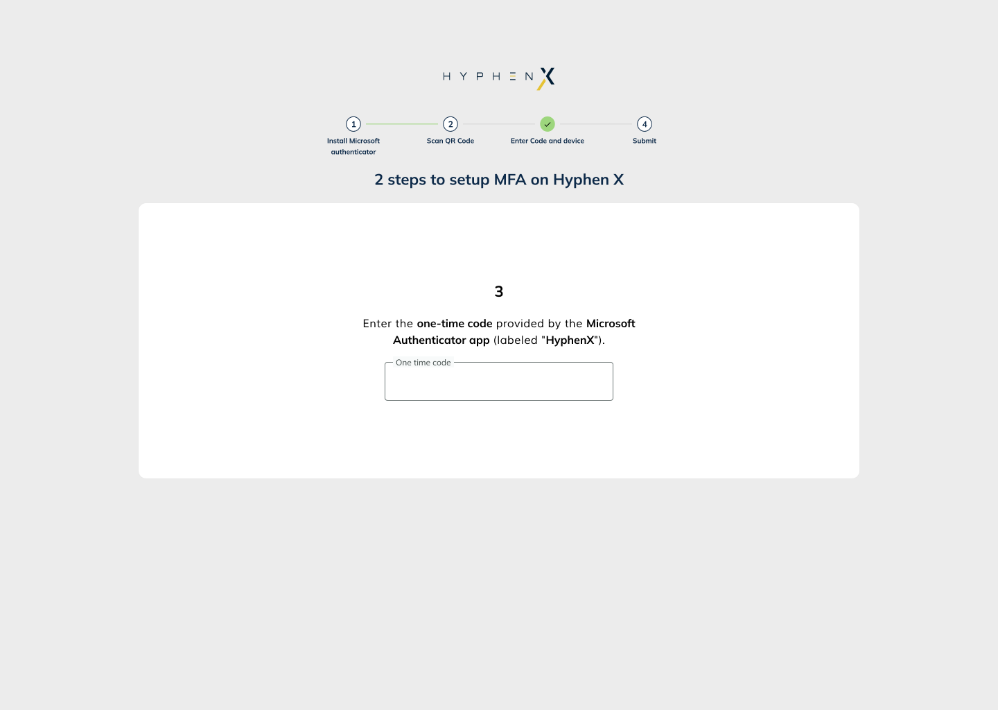
Each screen in the MFA setup flow presents exactly one primary action. This mirrors progressive disclosure: users are never asked to make multiple decisions at once during a security-sensitive flow.
Email templates as brand touchpoints
The transactional emails carry the platform brand, not just the content. The landscape-format email (dark navy, HyphenX branding) was designed as a companion to the setup flow, reinforcing trust at the moment users complete account setup outside the app.
Security Officer as a distinct user type
Rather than adapting the standard user flow, I designed a dedicated parallel journey for Security Officers. The SO has elevated permissions, and their creation flow reflects that clearly rather than making it feel like a generic admin experience.
The full design output
4-Step MFA Setup Sequence
What was delivered
I led both UX strategy and UI execution on this project. Working alongside a system analyst to map the system touchpoints (Keycloak, Comms Manager, HyphenX UI), I translated that architecture into user flows, designed every screen and state, built the email design system, and produced Figma deliverables ready for development handoff.