One component.
Many products.
Several HyphenX products shared a common need: uploading large sets of records in batch. Each had a different data context, different file expectations, and different user types performing the upload. The goal was one enterprise-grade Batch Upload component that could be consumed across all products without each team redesigning their own version.
This is a design systems problem as much as a UI problem. The component had to be opinionated enough to guarantee consistency, but flexible enough to handle real-world variation across five different product contexts.
A platform-level component owned by the design system, versioned, and distributed to product teams as a building block.
The full project team
Building for reuse, not repetition
Auditing existing batch upload patterns
Before designing anything new, I audited how batch uploading was being handled across existing products. The audit revealed three different ad-hoc implementations, each with their own dropzone, validation behaviour, and error pattern. None were consistent with each other or with the wider design system. This gave me a clear baseline of problems to consolidate.
Defining fixed vs flexible properties
A reusable component is only useful if teams know what they can and cannot customise. Fixed properties: interaction model, validation behaviour, progress indicators, error states, typography, spacing. Flexible properties: accepted file types, max file size, label copy, column mapping per product. This became the contract between the design system and product teams.
Designing the full state inventory
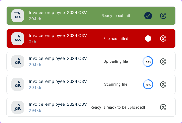
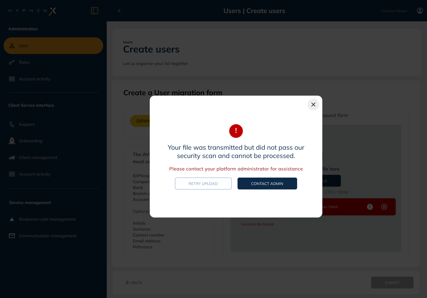
Enterprise components fail when state coverage is incomplete. I designed every state: idle, file selected, uploading, validation in progress, validation error (row-level and file-level), partial success, full success, and timeout/network error. Each state has a clear visual treatment and a user path out of it.
Row-level error design
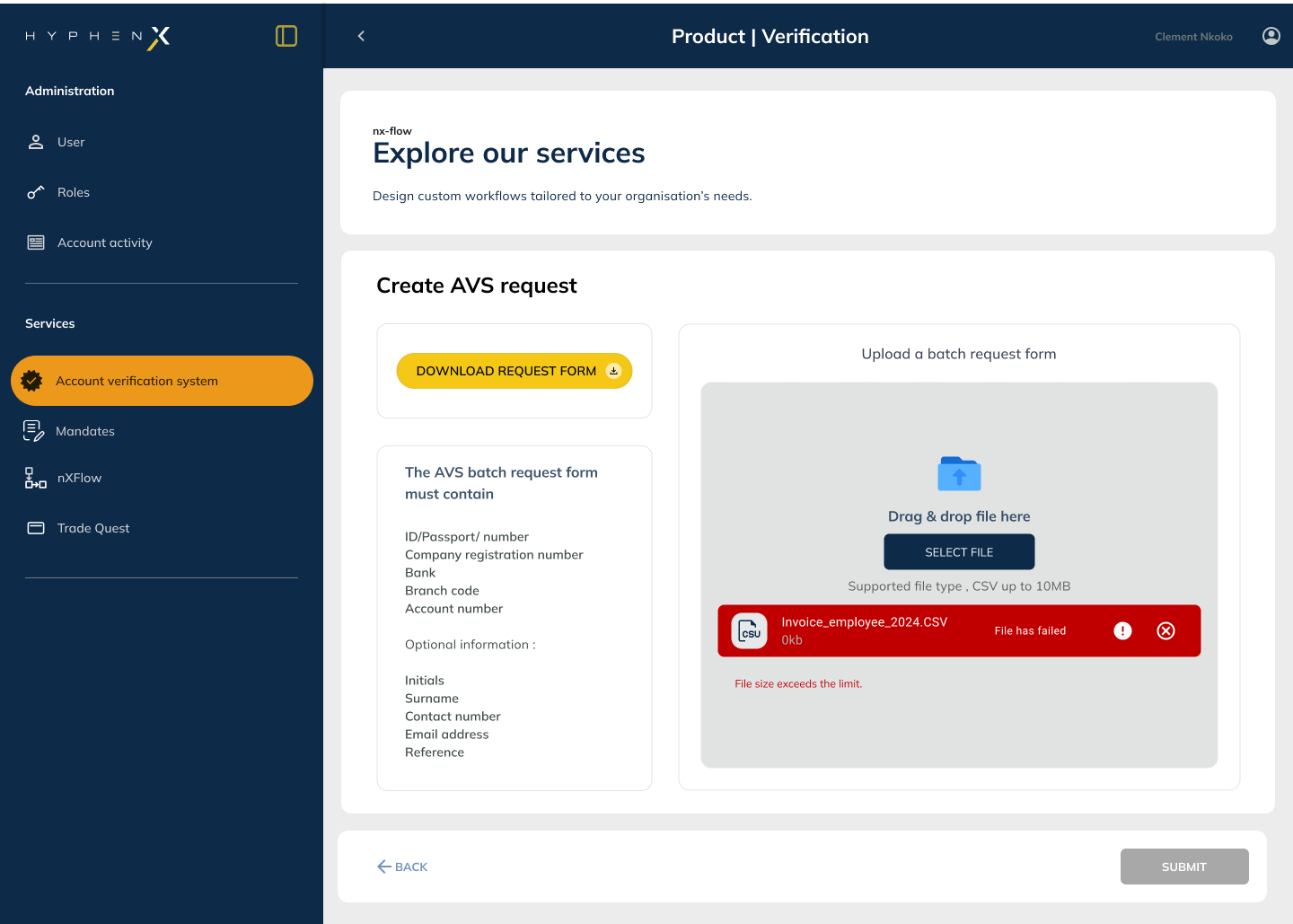
The most complex challenge was row-level validation errors, where a file passes format validation but contains individual records with data issues. I designed an inline error table surfacing row number, field name, and reason, allowing users to correct and re-upload without losing the valid records already in the file.
Component documentation and usage guidelines
The component shipped with a full usage guide in Figma covering when to use it, required vs optional configurations, accessibility requirements, and annotated examples across nXFlow and AVS. This made adoption self-serve and reduced design review cycles for product teams.
Every state, designed
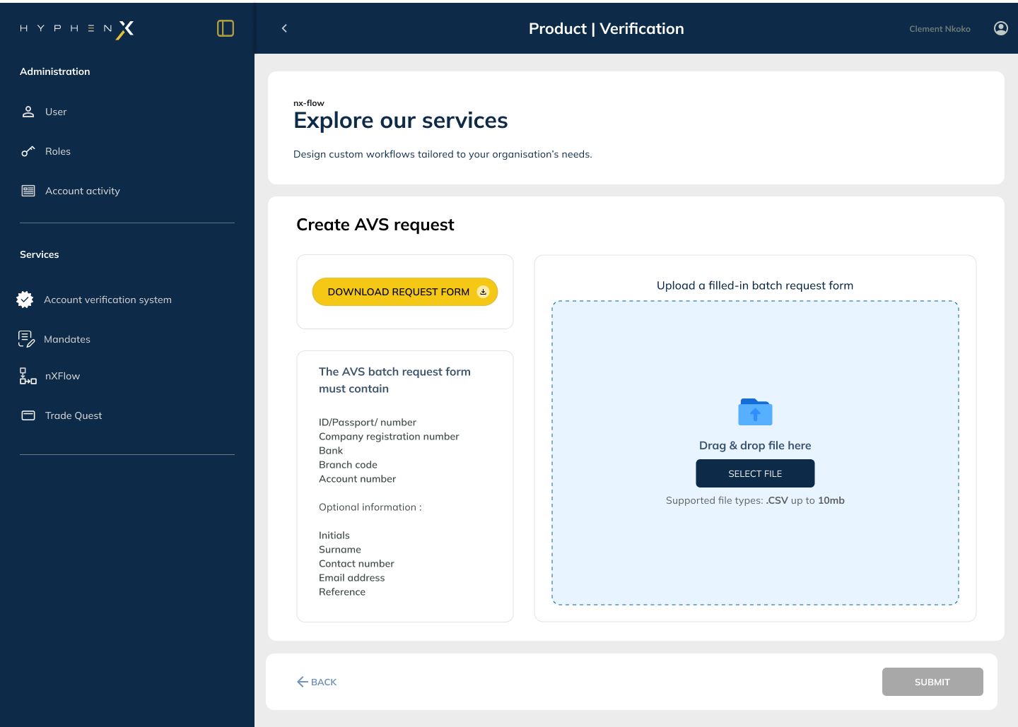
Idle / Empty
Dropzone with dashed border, upload icon, file format guidance, and max size. Clear call to action for drag-and-drop or browse.
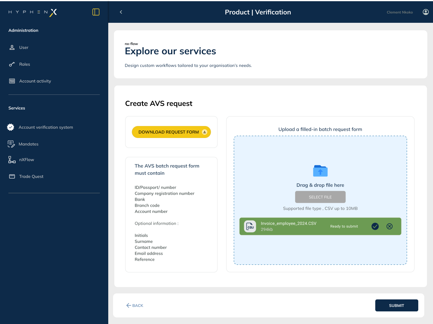
File Selected
File name, size, and type shown. Preview row count if parseable. Clear upload action and option to remove and choose a different file.
Uploading
Progress bar with percentage. Cancel option visible. File name persists for reassurance. No other interactions enabled during upload.
Validation Error
Row-level error table showing row number, field, and reason. Colour-coded severity. Download corrected template available.
Partial Success
X records uploaded successfully, Y records failed with reasons. Option to download failed rows as a correctable file.
Full Success
Confirmation with record count, timestamp, and reference ID. Clear path to the next action (view records, upload another batch).
The component in context
What made it enterprise-grade
Fixed interaction model, flexible configuration
The dropzone interaction, progress pattern, and error table structure are fixed. File type, size limit, and column mapping are configurable per product. Teams get consistency in the user experience without losing the ability to adapt to their specific data context.
Row-level errors, not file-level rejection
Rejecting an entire file when 3 of 500 rows have errors is terrible enterprise UX. The component surfaces granular row-level errors in a sortable table with a downloadable "failed rows" CSV, so users can correct and re-upload only what failed without starting from scratch.
No hidden state during upload
Large file uploads can take time. Progress is fully visible: file name, percentage complete, and a clear cancel option. Users should never wonder if the system is working or has stalled.
Correctable template on error
When validation fails, the component offers a correctable template download pre-populated with the user's data and error columns highlighted. Enterprise users often work in spreadsheet tools and need to correct data where they created it, not within a browser form.
Accessible drag-and-drop with keyboard fallback
The dropzone supports drag-and-drop but never requires it. The "Browse files" button is always present, always focused on tab, and the component meets WCAG 2.1 AA requirements: a non-negotiable for enterprise procurement.
Reference ID on success confirmation
Every successful batch upload generates a reference ID shown prominently on the success screen. Enterprise users reference uploads in support tickets, audit trails, and reconciliation reports. Surfacing this immediately and making it copyable removes a support burden downstream.
What was delivered
I designed the Batch Upload component from audit through to final Figma specification, including the full state inventory, the fixed/flexible property framework, the row-level error table pattern, and the usage documentation. The component was built to operate as a design system building block: opinionated where it needed to be, flexible where product teams needed room to adapt.