A flow that existed
in name only
The "Forgot password?" link existed on the HyphenX login screens but the journey behind it was incomplete. A basic email input screen was there, but there were no error states, no password strength feedback during creation, no confirmation email design, and no verification email. Users who hit any edge case had no guidance and no way forward.
As Lead UX and UI Designer I owned both the journey design and the visual execution end to end. I mapped every path, designed every state, and built out the complete flow from a forgotten password trigger through to successful creation confirmation.
Empty submission, invalid format, unregistered email, and rate limiting all led to the same blank failure with no feedback.
No indication of password strength during reset or creation. Users had to guess what would be accepted.
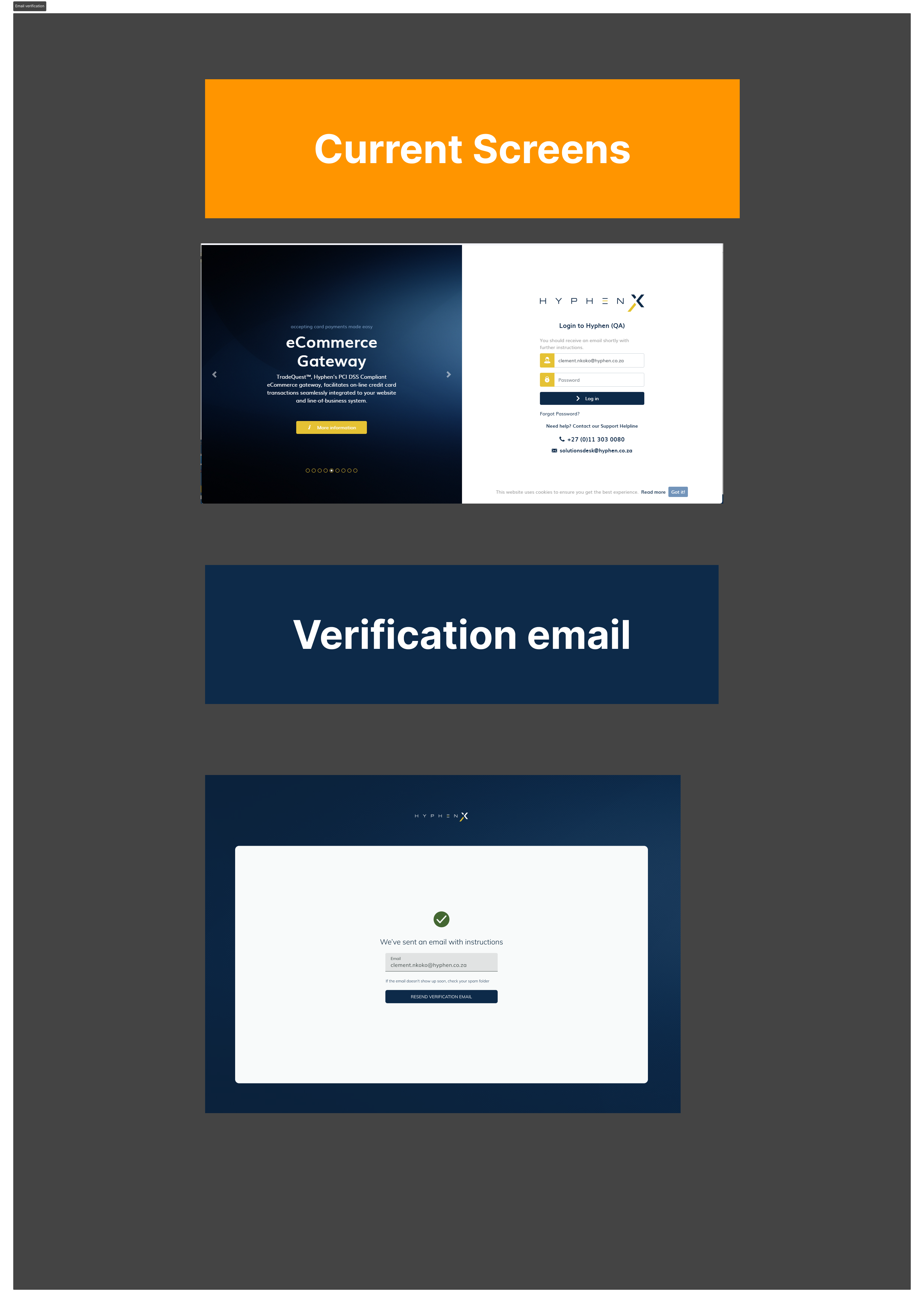
Reset and verification emails were unstyled plain text with no HyphenX brand presence.
The full project team
From entry to
confirmation
The redesigned forgot password screen is clean and focused: a single email field, clear instruction text, and a submit button that is disabled until the field contains input. Once submitted successfully, the screen transitions to a confirmation state with a green checkmark and a plain-language message confirming the email has been sent, with an option to resend if it does not arrive.
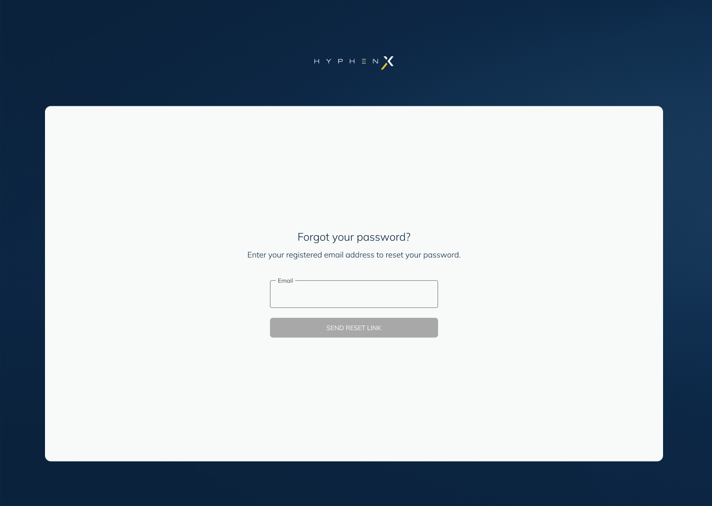
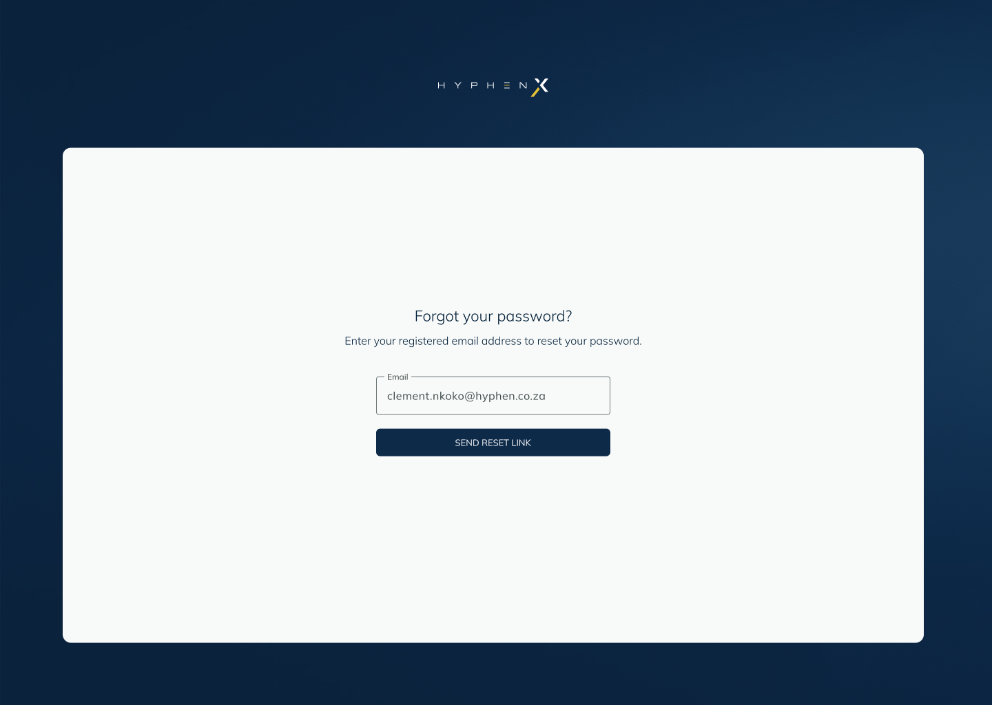
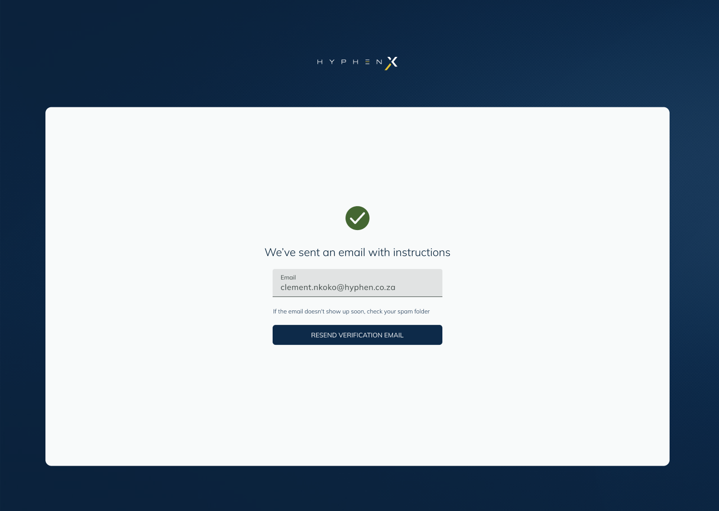
The success state uses a green checkmark and a single clear sentence. No body text, no instructions, just confirmation that the email is on its way, and a way to resend if needed. In a security flow, less is more.
Every failure path
designed and named
The original flow had one response to failure: nothing. I mapped every realistic failure scenario and gave each one a distinct, specific response. Users now know exactly what went wrong and what to do next, whether that is correcting their input or waiting before trying again.
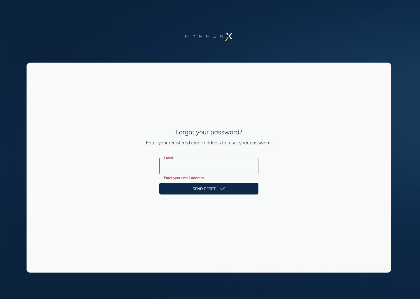
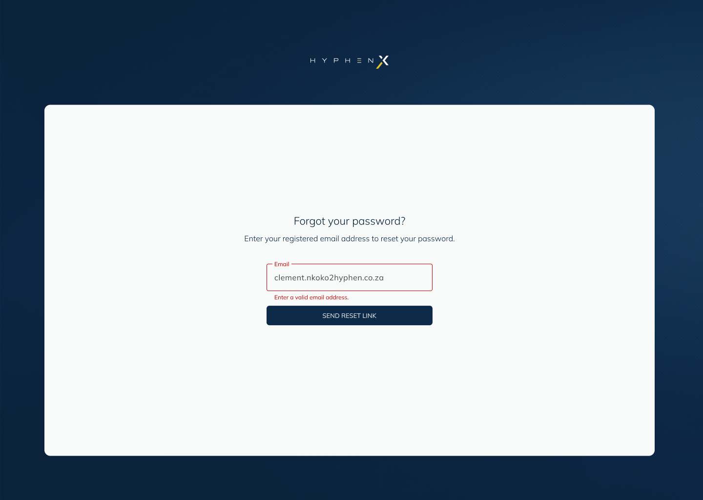
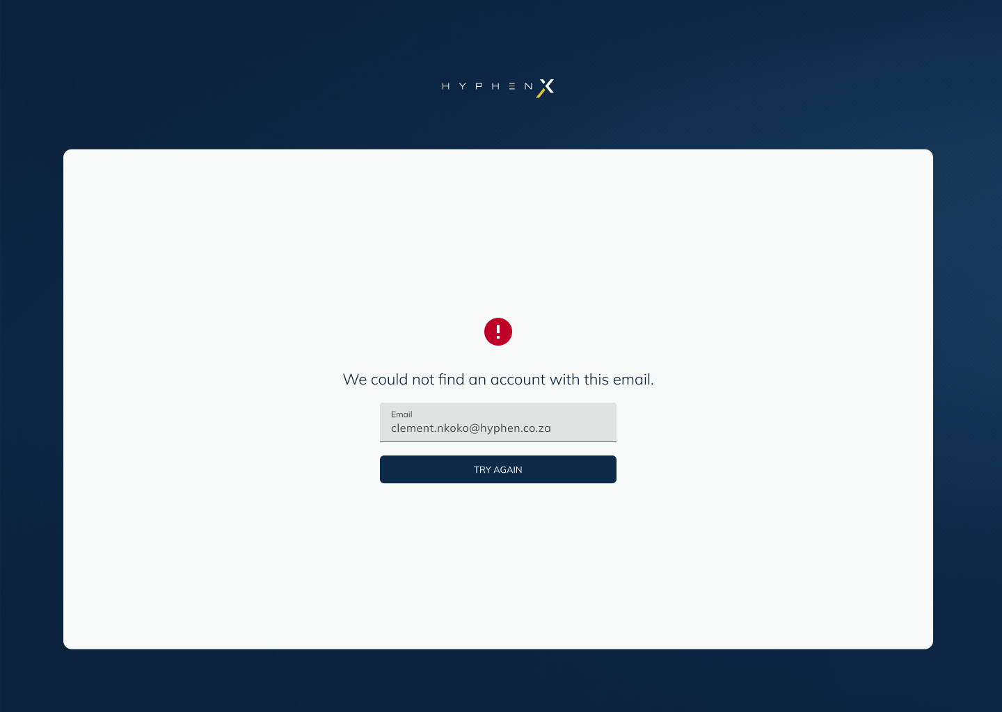
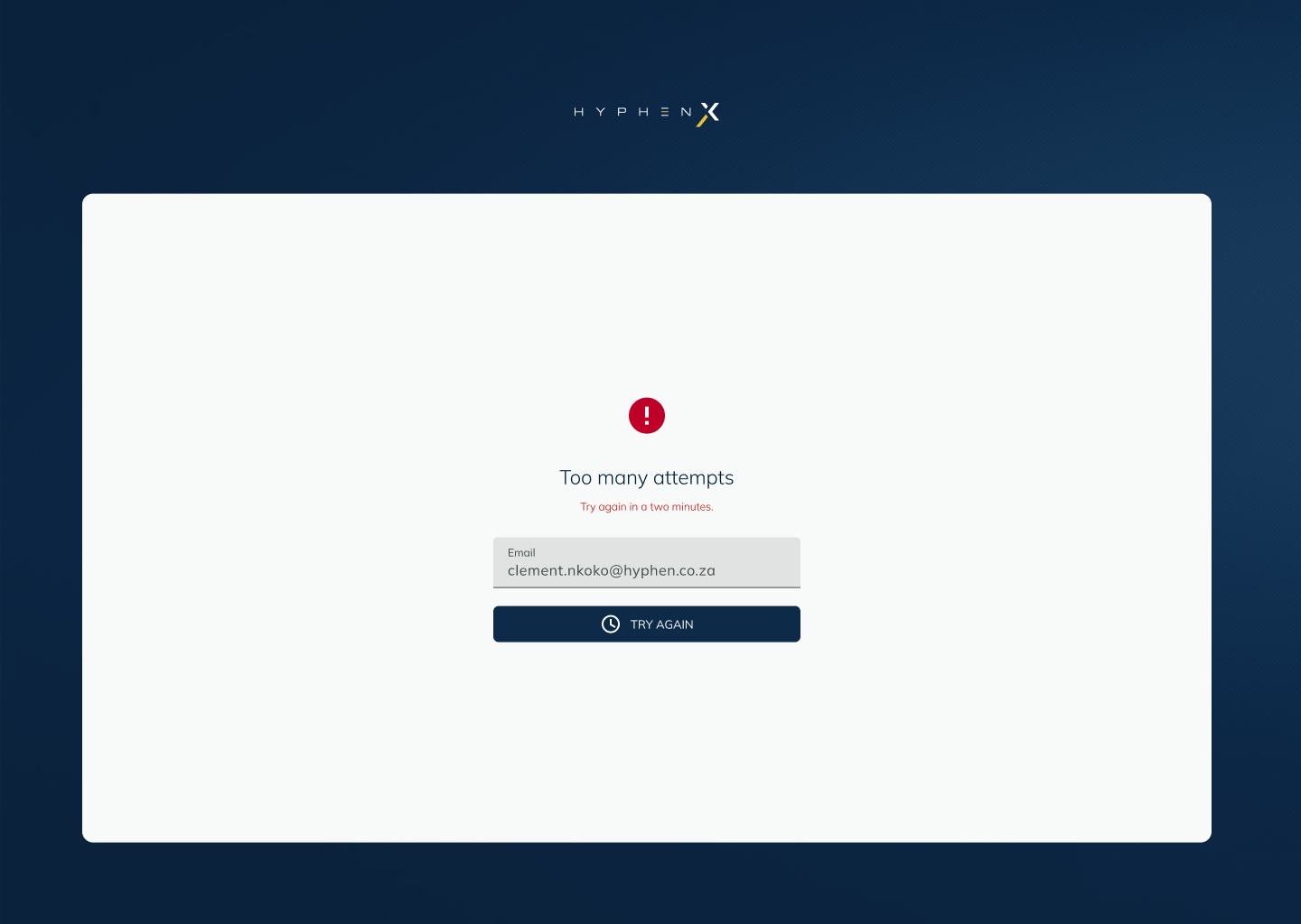
Inline errors sit beneath the relevant field for input validation issues. Server-side errors (unregistered account, rate limiting) replace the form with a full-screen error state and a single clear action, try again or go back. The distinction matters: inline errors let the user correct without losing their input; full-screen errors signal that something systemic has happened.
Real-time feedback
as you type
The Create New Password screen shows a password strength metre that updates in real time as the user types. The metre has four states, empty, weak, medium, and strong, with a coloured progress bar and a live requirements checklist below. Each requirement ticks off individually as it is met, so users know exactly what is still needed rather than receiving a vague "password not strong enough" rejection on submission.
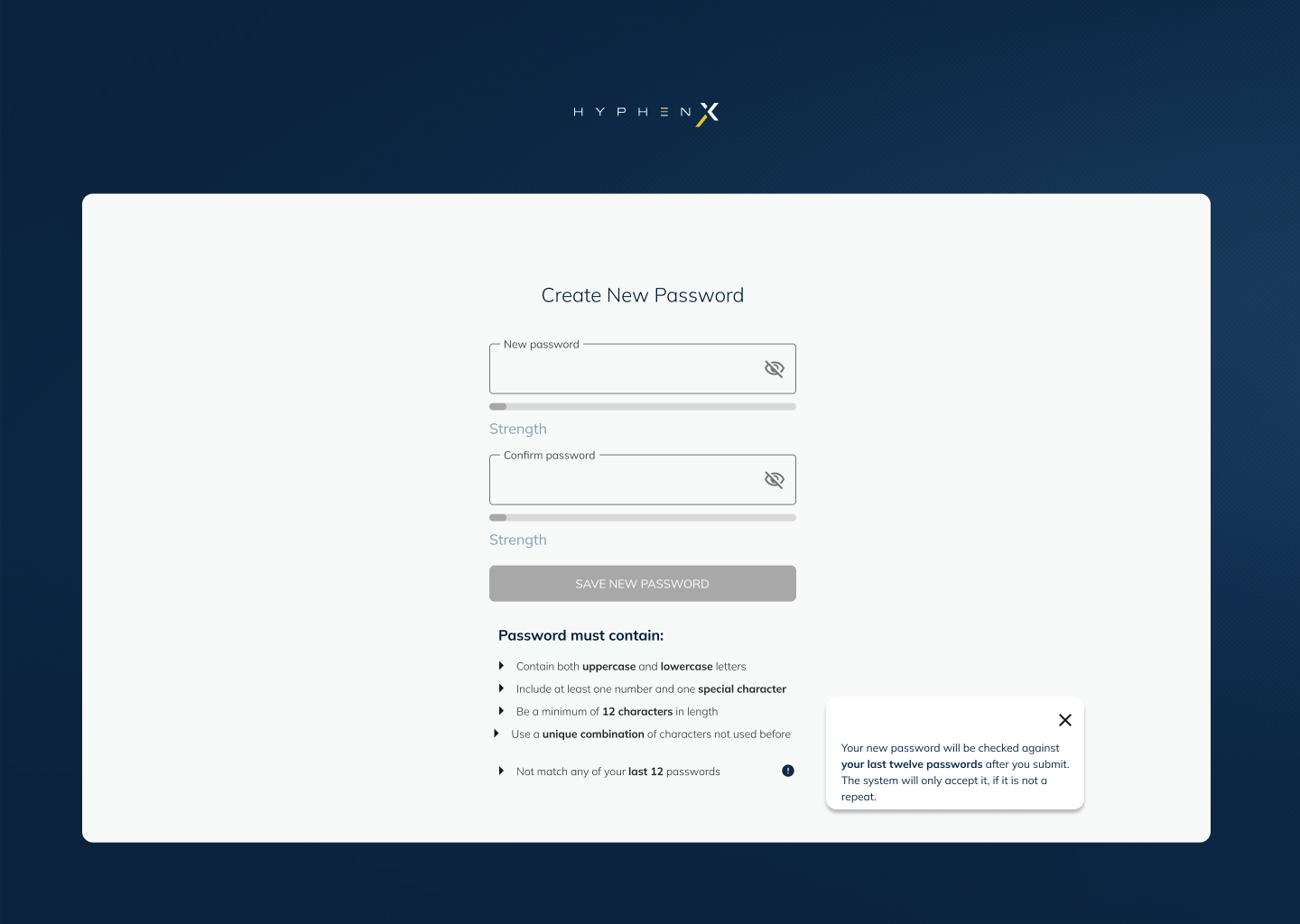
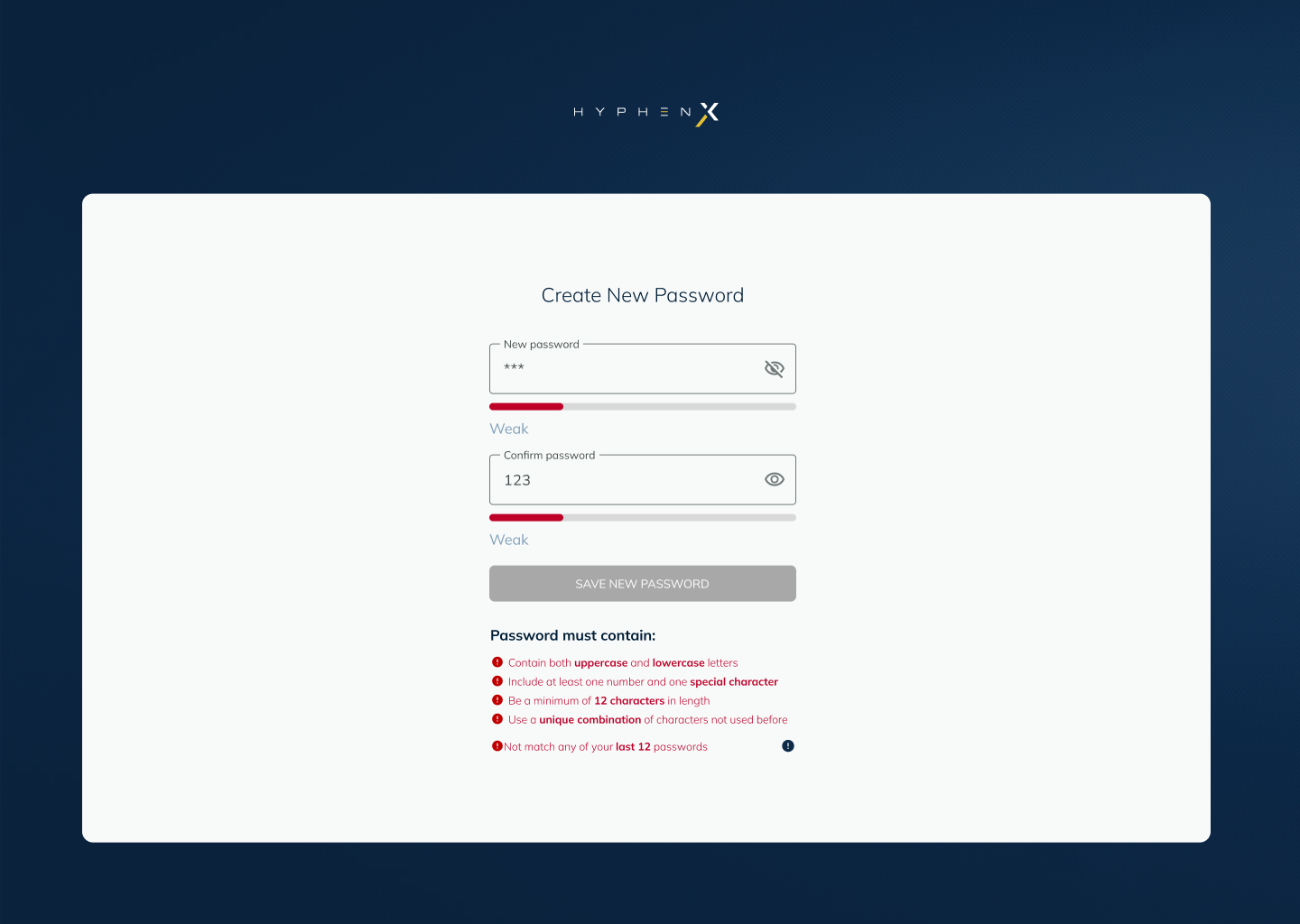
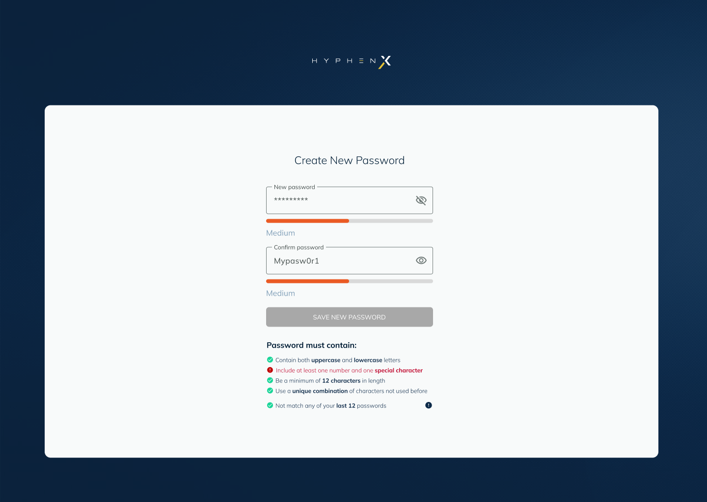
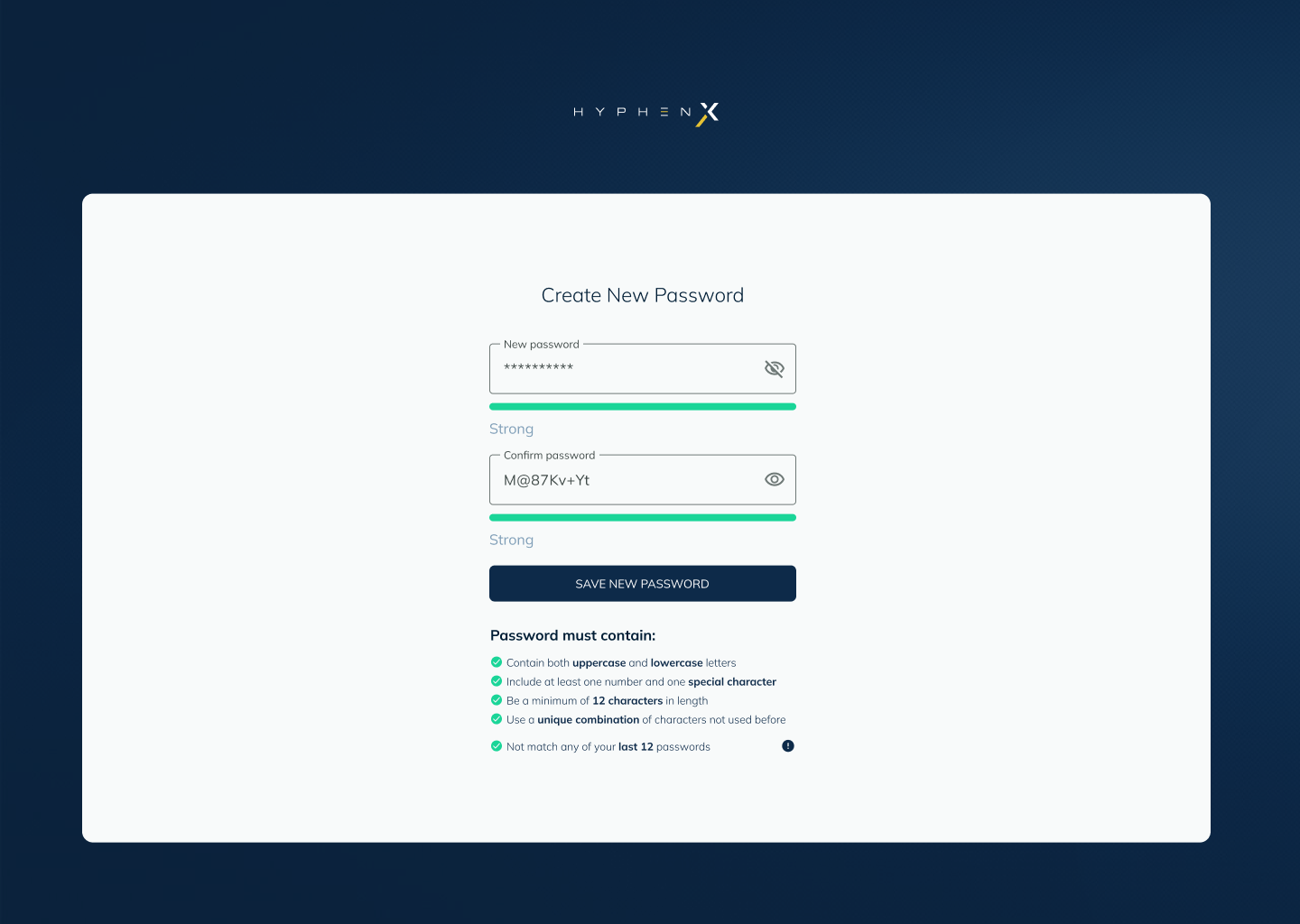
The submit button stays disabled until the password reaches a minimum acceptable strength. This removes the need for a post-submission error about password complexity, the form simply will not let you proceed until the password is good enough. Guidance happens before submission, not after rejection.
The same system
for the reset flow
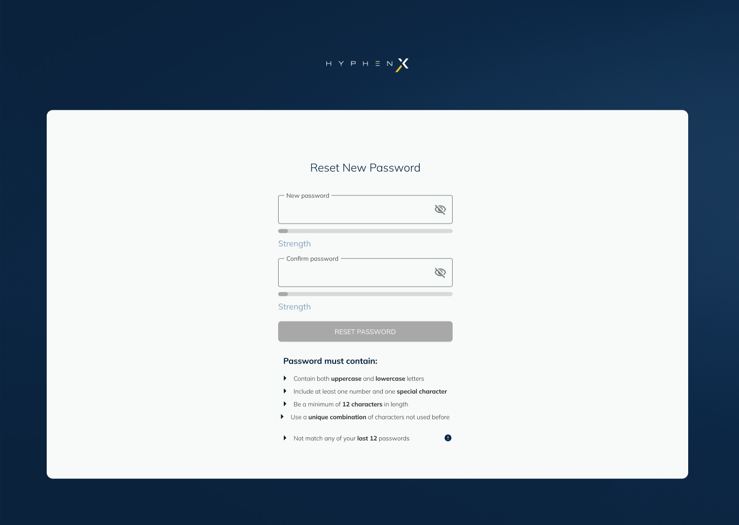
The Reset New Password screen uses the same strength metre system as Create New Password. The form pattern is identical, same field layout, same metre, same requirements checklist, so that a user who has previously created a password already knows how to interact with the reset form. Consistency between these two screens reduces cognitive overhead in what is already a frustrating moment for the user.
The brand
in the inbox
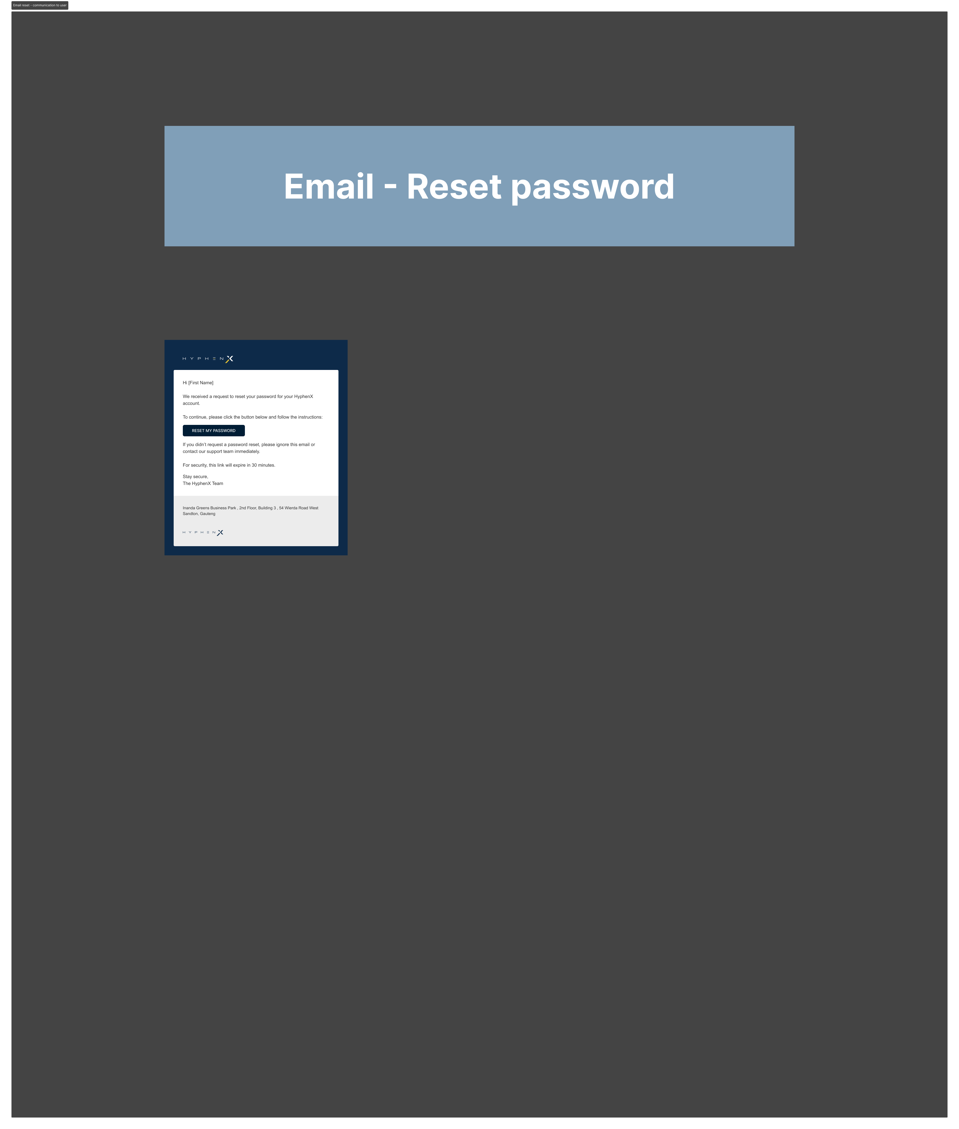
The transactional emails were designed as a direct extension of the HyphenX brand. The reset password email carries the logo, a single clear action button, and a plain-language safety note for users who did not request the reset. The verification success email confirms the account with a checkmark and equally clean messaging. Both use the same email template component that runs across all platform communications.
Completing the
half-built journey
Password reset is one of those flows that gets shipped in a basic state and then sits there. The happy path works; everything else is a dead end. The value of this project was in treating the edge cases as equally important as the main flow, because for a user locked out of a financial platform at a critical moment, the error state is not an edge case. It is the entire experience.
Having lead responsibility over both UX and UI meant the logic and the visual execution were always in sync. The form, the metre, the error messages, and the emails were designed as a single coherent system rather than separate deliverables handed between people.